Planet Be
designed by Giorgio Schwarz
for World Bank Group

The Idea
Concept based on the world I want to preserve for the future changing tone of voice in a positive e believable future to be.
We aimed to change people’s POV from “The world is watching” to “The world is doing”.
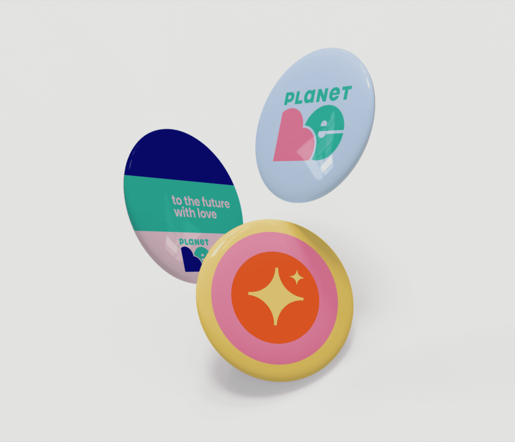
Planet Be is the name we invented to drive a call to action & project mantra.
To the Future With Love the headline of the first project of the brand.
Planet Be is a cool movement that is acting to select all the good habits, landscape, way of thinking, community vibe, human rights, necessary to save just the good part of the world.
A new train of hope which becomes trendy and makes you believe we can.
A young, funky, meaningful & emotional cool driver & ironic tone of voice to reach all people.
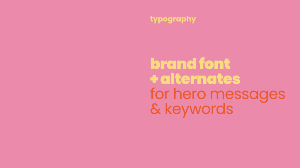
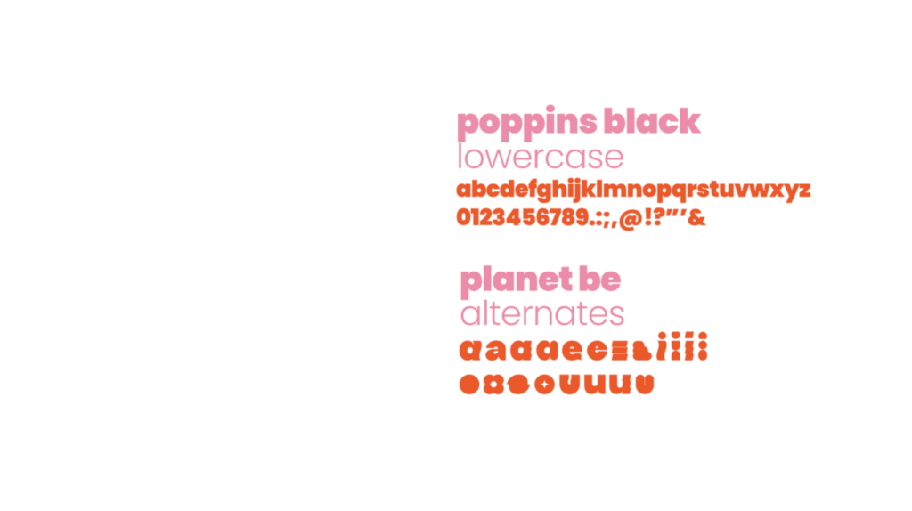
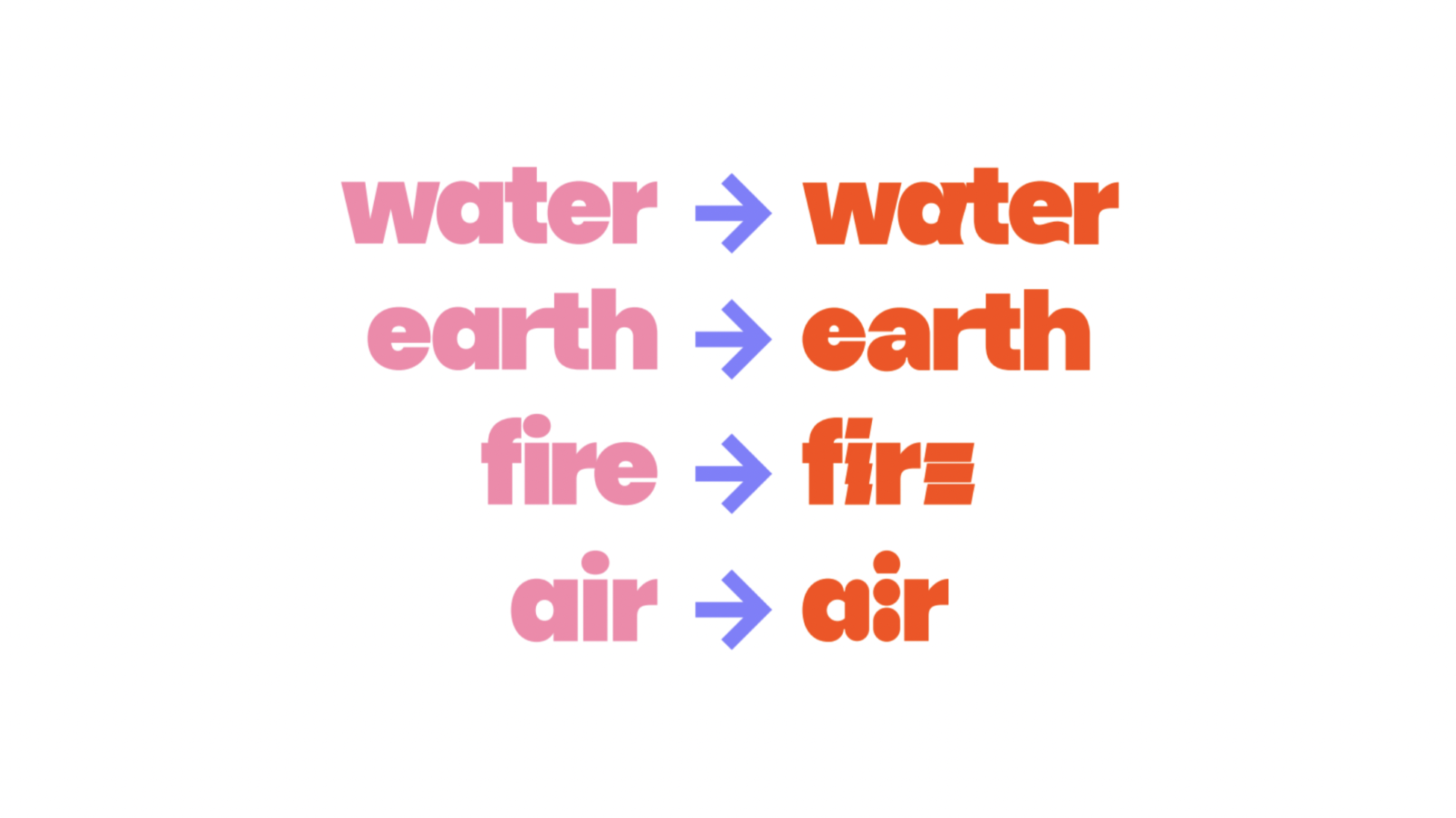
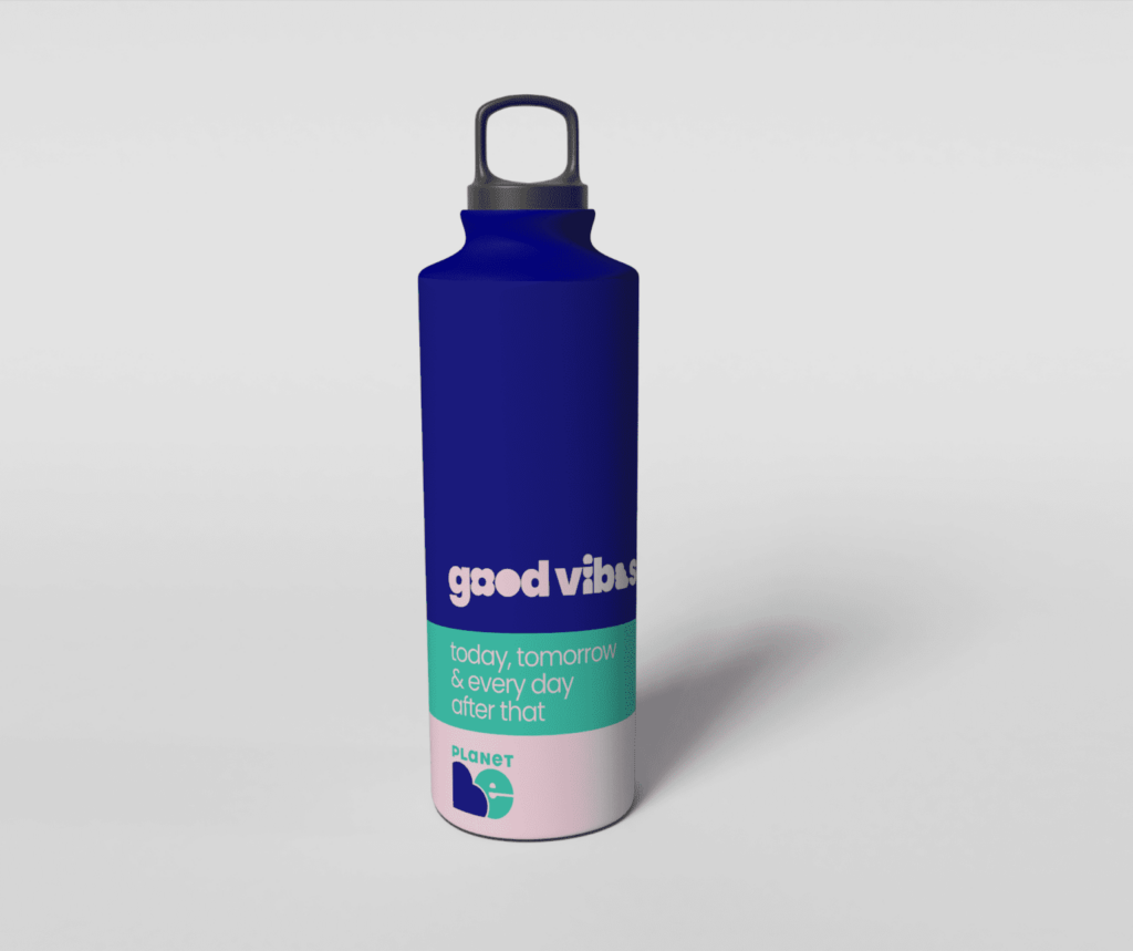
Typography has designed to be very important, because it represents the tone of voice. We have individuate 2 fonts: One with a strong sign, recognizable and that gives us a joyful dna, and one simpler and clean for the institutional infos.
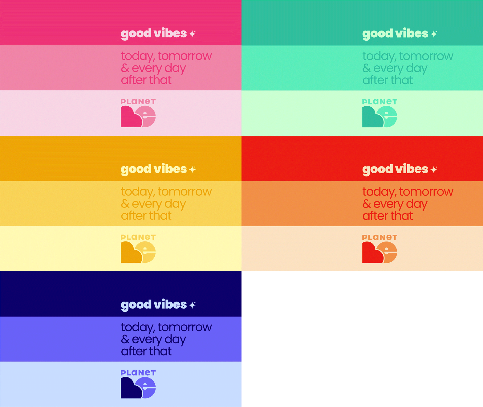
Visually Planet Be identity can’t be black and white. The message is inclusive and has to spread joy, energy and positivity.
It is bright and strong, to bring coolers to the project, to make it visible and fun.
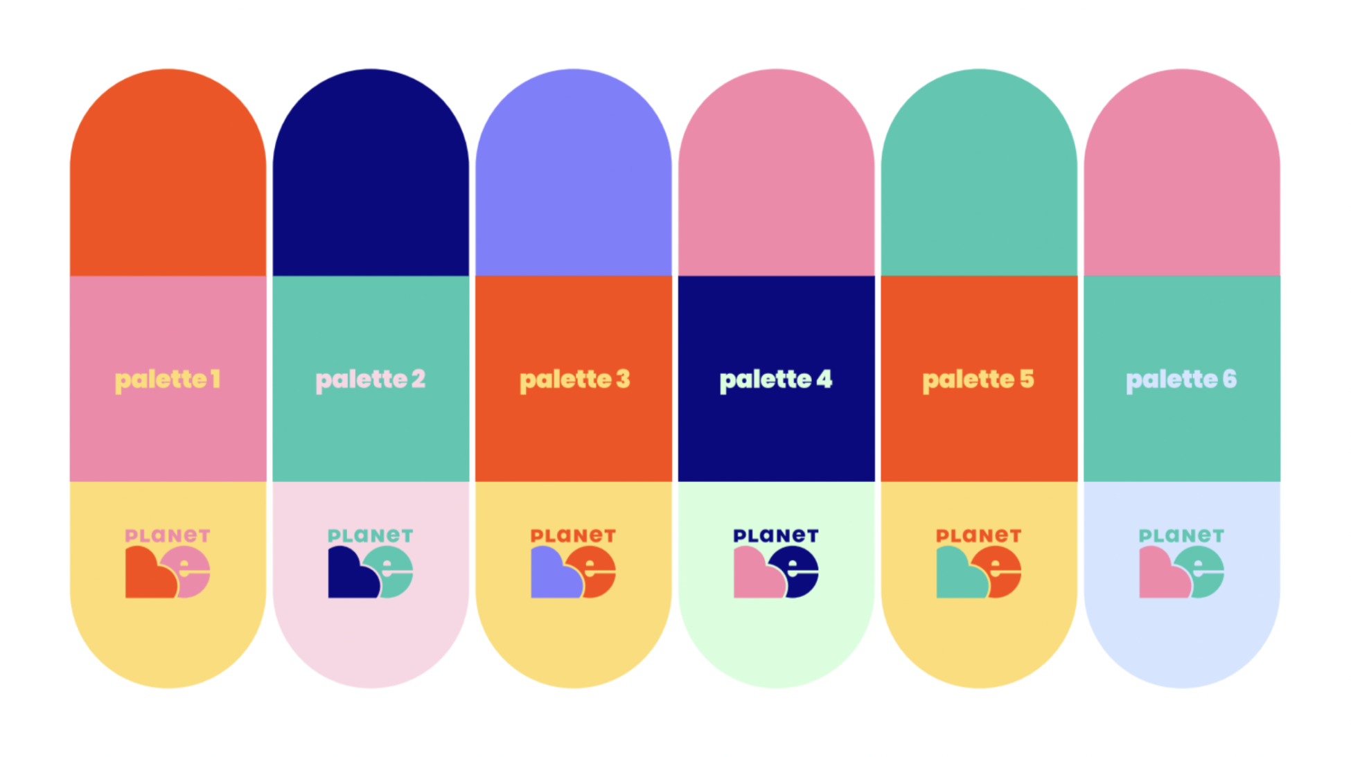
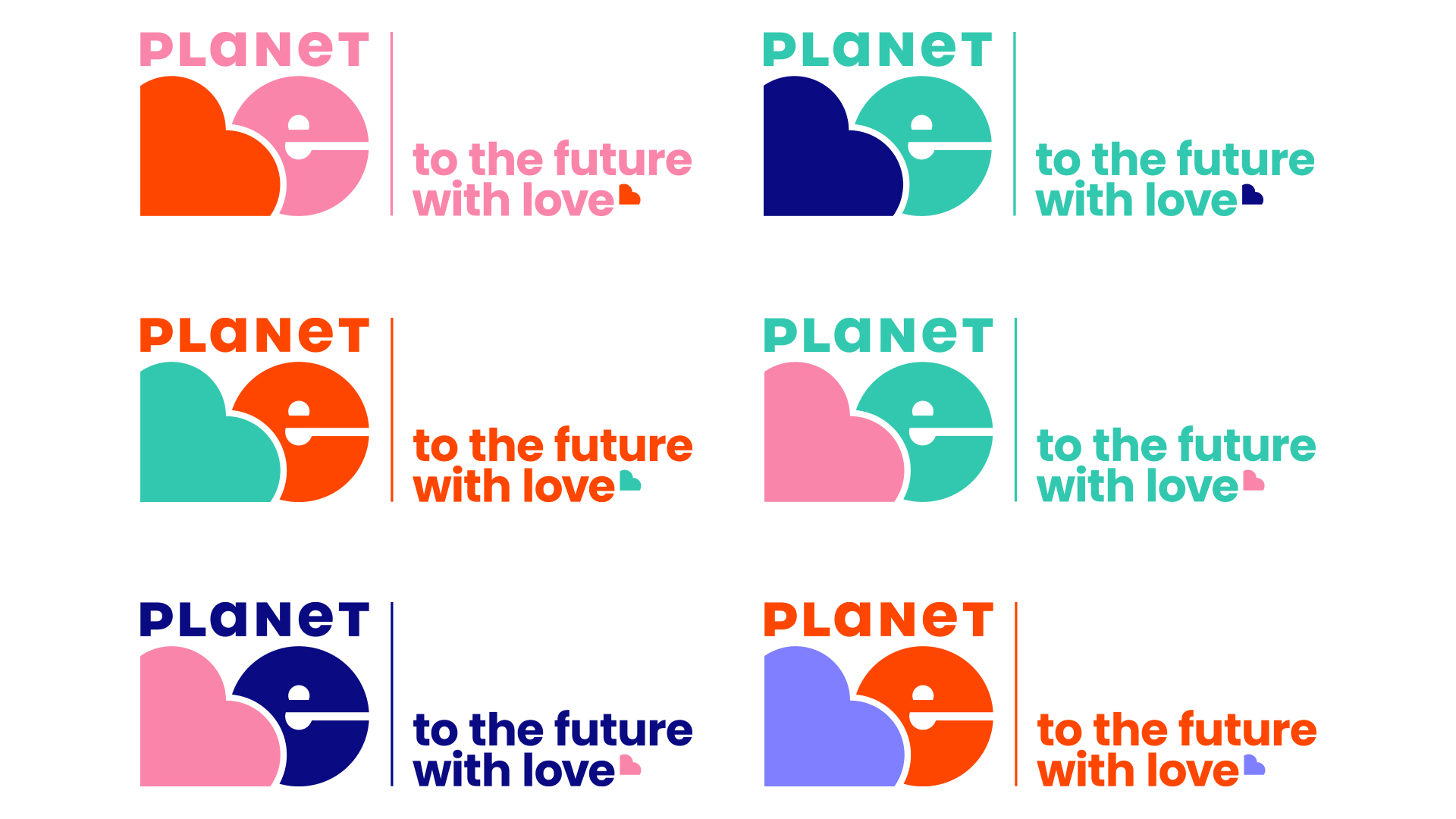
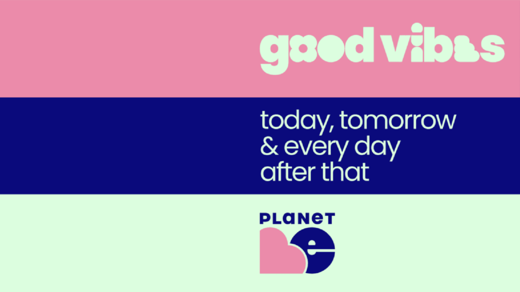
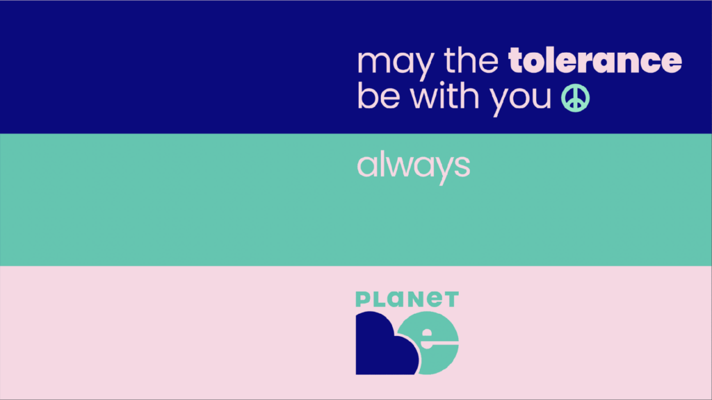
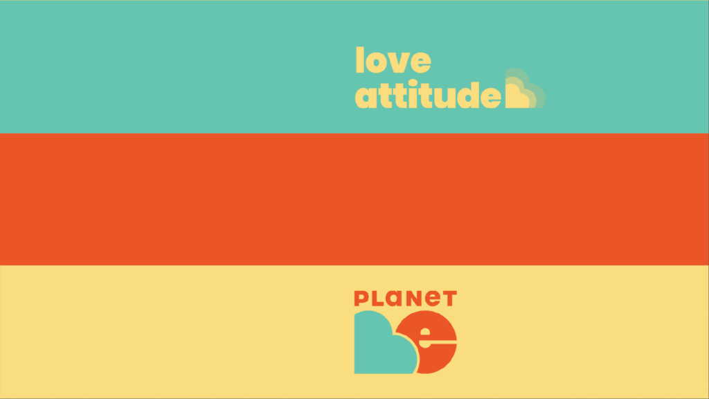
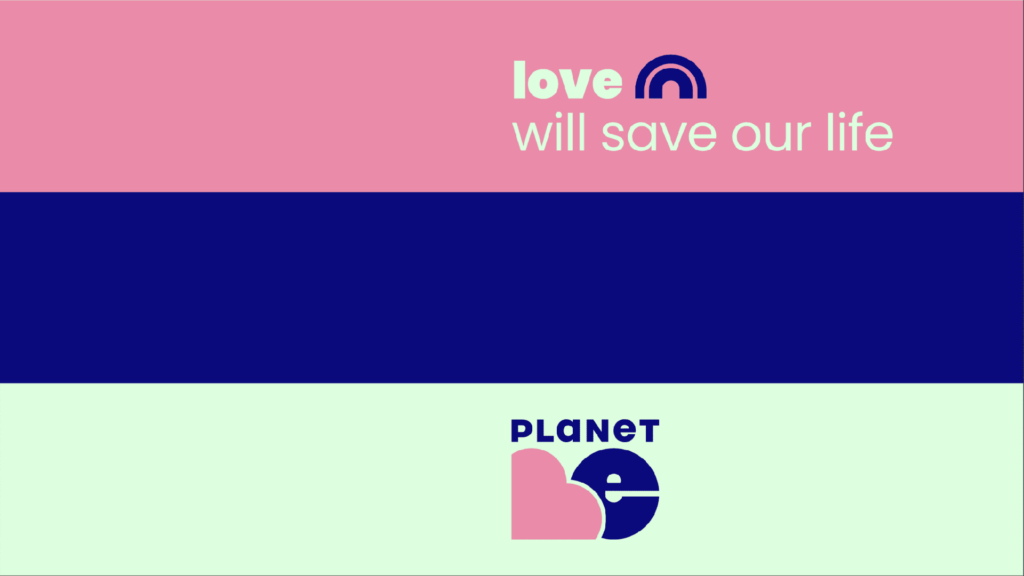
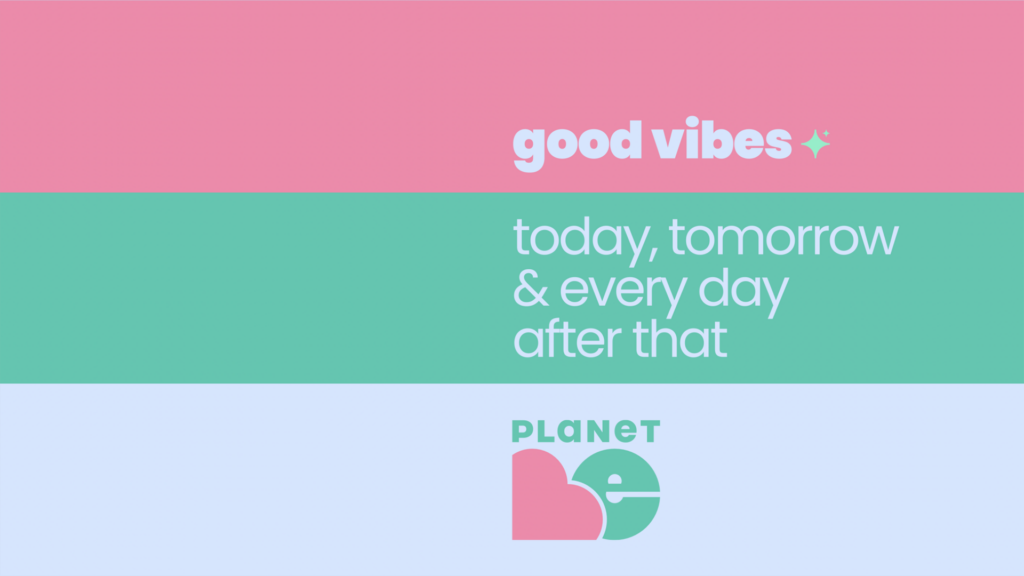
As an outcome brand identity we nailed down 6 possible color combinations, all based on pop and bright tones but with a vintage flavour for the main brand communication.
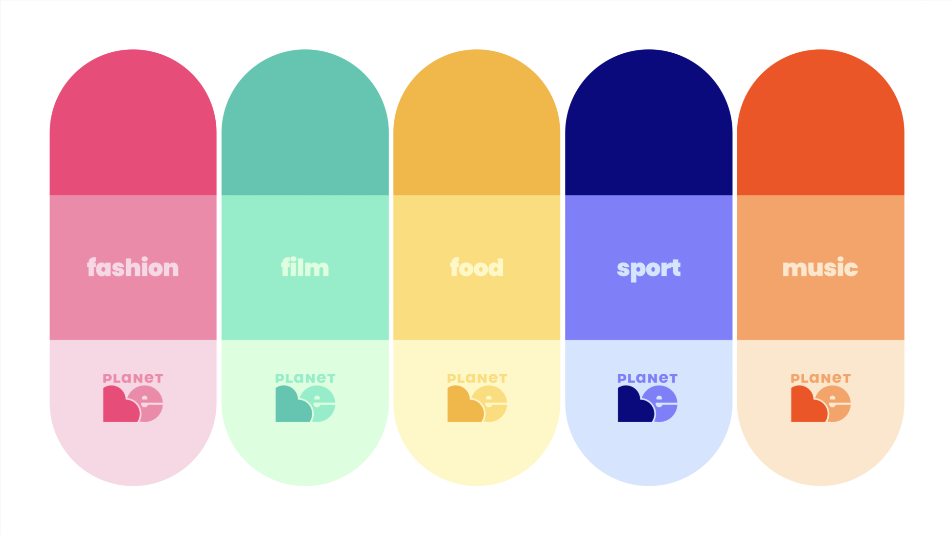
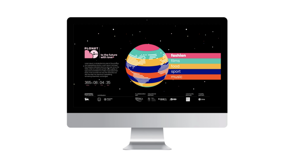
Additionally to separate main identity & thematic communication, we developed 5 monochrome color palettes for every creative industry: music, film, fashion, food and sport.
Every topic has one main colour in 3 different grades and color palette is a shades of it.
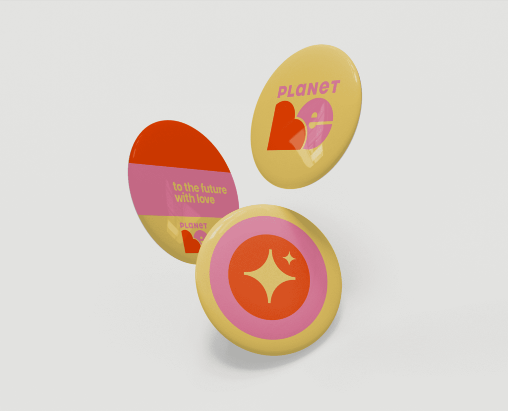
The project targets different age audience with a focus on younger generations, because of that we made it very digital with a touch of nostalgic vides. Visually logo was influence by aesthetics of previous decades and combined with bespoke icons, that like an emoji are necessary part of nowadays communication.
The Primary Communication





The Icons


The Thematic Communication


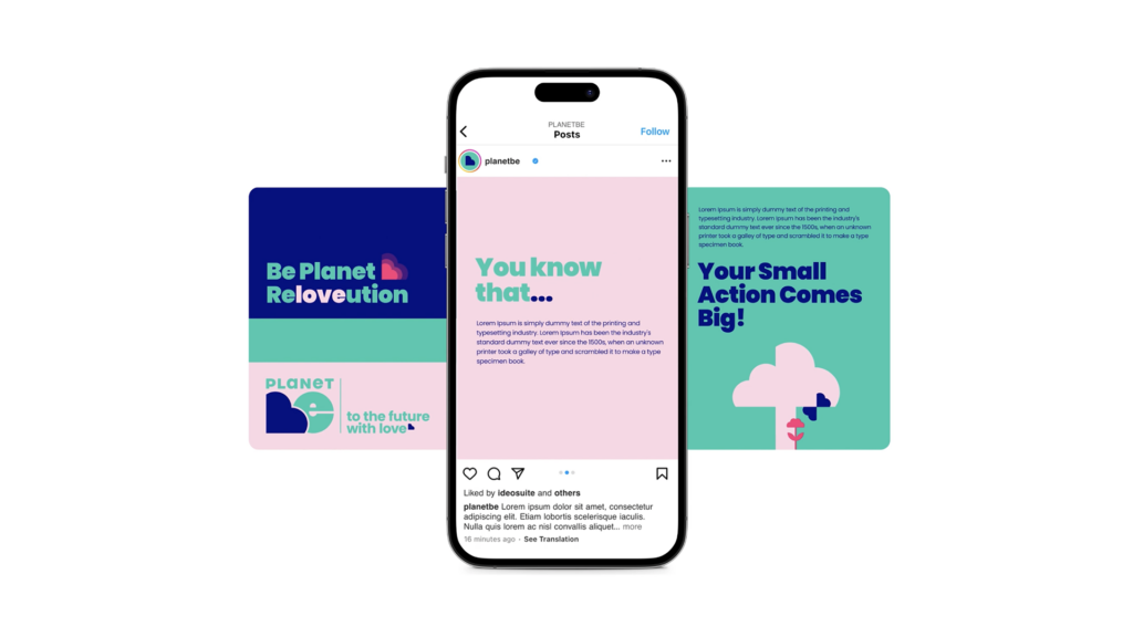
The Digital Promotion

About
Cecilia Moro
Cecilia Moro comes from Publicis where she worked for 7 years on creative projects in the fashion, automotive, food & beverage sectors. She previously worked at J.W.Thompson and TBWA, where she began her career as an art director after a Masters at IED and Central St.Martins School of Arts. Art Director on both conventional and unconventional media, online and offline communication, integrated campaigns, digital platforms, activations.
Food lover. Kids stuff designer. Also mother of Vittoria, she highlights: “My best creative achievement so far.”
About
Giorgio Schwarz
Giorgio Schwarz in an Italian design director working in a variety of fields and techniques including animation.
In the past 10 years he worked with International broadcasting companies, such as Discovery, Viacom
and Gazprom Media. He has a unique and clean style with a combination of design driven approach to creativity and problem solving.
During his career Giorgio won Promax Award multiple times, participating in projects worldwide.

The End
Cecilia Moro
