

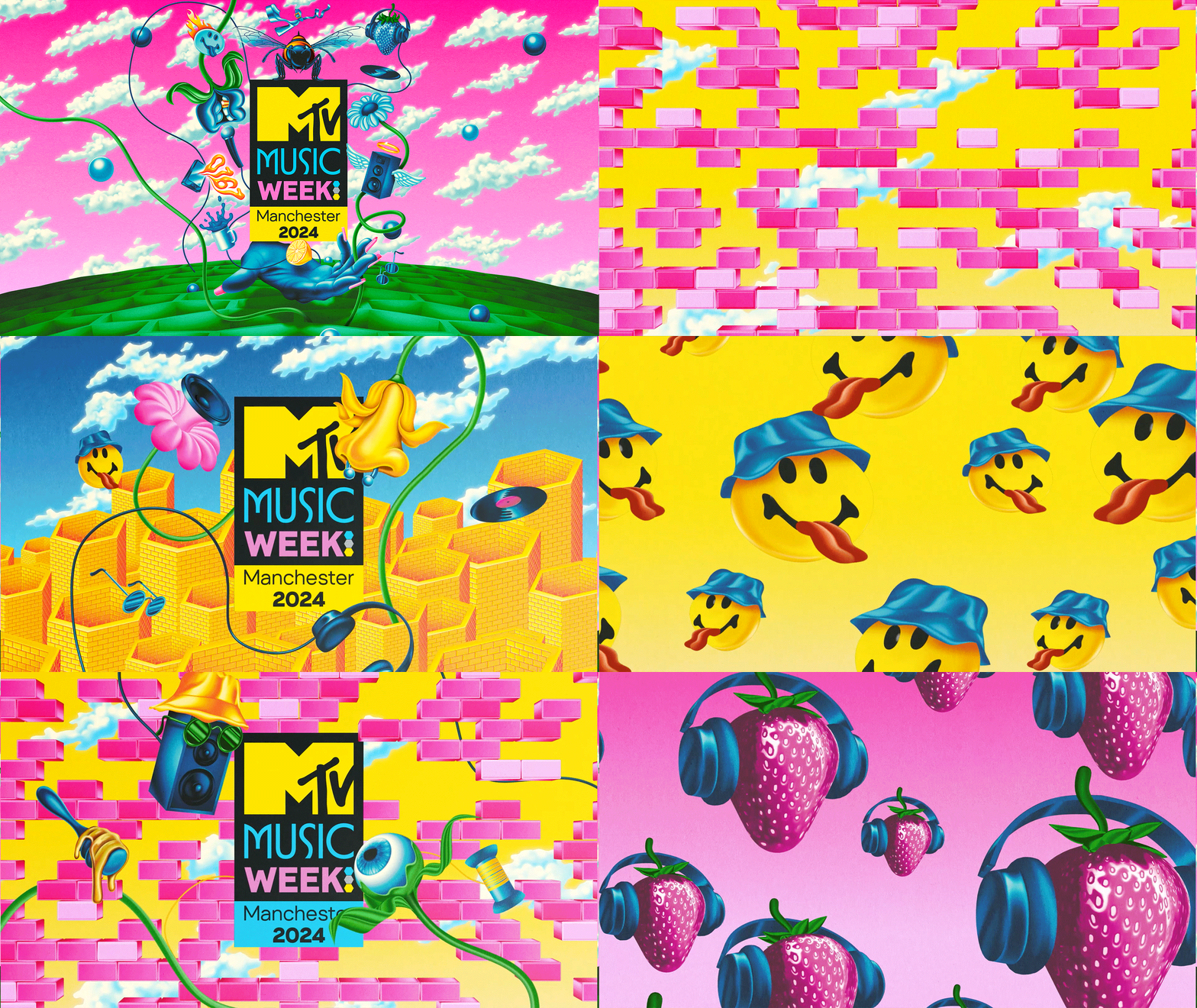
Music Week Manchester
designed by Samuel Thomsky
for MTV
The Brief
Paramount has commissioned Pink Salt to create the visual identity and promotion pack for the MTV Music Week 2024 in Manchester in the lead up to the EMA’s. The event will be running a number of music related events across the city. Our mission was to create vibrant and engaging branding for this event. The Concept for the project required a flexible toolkit that can be customized for On- Air, Promos, OOH, City Invasions On The Ground, Digital and Merchandising.
The goal was to create music moments that matter. The visual identity should capture the essence of Manchester’s rich music
culture and feel fresh, current, and distinctly local. Most of all, the aim is to get young local music lovers excited about Music Week hitting their hometown. The mission is to be Bold, Real, Fun.

The Promo
The Idea
The idea was to represent music as the fabric of the city just as much as the omnipresent bricks, mills, and chimneys are, hence the brick motif.
The secondary subtext that has inspired Sam Tomsky for the bricks is a celebration of Manchester’s post-industrial reinvention of itself as a home of musical innovation. for example, previously industrial spaces are repurposed as sites of creativity. mills, garages, and old factories are transformed into artist studios and music venues, which allow young people the space they need to express themselves.
Tony Wilson is often quoted as saying ‘Manchester kids have the best record collections,’ which can be seen as a sort of shorthand for the way in which so many diverse influences feed into the music scene here. the design itself pays homage to this by comprising lots of little Manchester references. the almost chaotic, layered composition is representative of the melting pot of diverse influences that make up the modern music scene here, from road rap to post-punk and neo-soul.
The viewer is encouraged to navigate the composition and pick out the visual references that speak to them. some included in the mock-up done by sam are Matt Healy’s fender mustang, an acid house smiley, and the 0161 area code.
Additional Manchester references are woven into the piece through the key colors in the design, using black, green, yellow, sky blue, pink, and purple, which are sampled from the color code included in Peter Saville’s 12″ cover for Blue Monday by new order, potentially the most famous piece of design associated with Manchester.

The Identity / Logo Design


The OnAir Promotion


The Digital Promotion


The Print & OOH


About
Samuel Tomsky
Samuel Tomsky is an illustrator and graphic designer based in Manchester who specializes in creating eye-catching and original designs for clients in the music industry and beyond. He has worked over the last seven years to help clients realize projects across a range of mediums, including editorial illustration, event branding, merchandise design, logo development, album artwork, and assets for social media.
As one of the four founding members of Bakkheia, Sam has spearheaded its aesthetic direction since its inception in 2016, utilizing illustration and design across events, record releases, and clothing to create a visual landscape that complements the label’s sonic world.

The End
- client
- Paramount Networks
- project
- Music Week 2024
- brand
- MTV
- design director
- Amy Shields
- sr director of production
- Marko Domazet
- sr production manager
- Kate Gregory
- design agency
- PINK SALT
- creative director
- Beatrice Cardile
- art director & designer
- Samuel Tomsky
- animator
- Giorgio A. Schwarz
- head of talents
- Irene Pollini Giolai
- studio coordinator
- Simone De Angelis