Domus Archive is a digital tool used for research, it’s a carnival of colours/ideas useful for developing new contents, following current events, history, culture and politics of the world. Through the archive Domus re-propose the political and social history of the last 100 years.
Keywords are:
#SURPRISING is the first one and #UNPUBLISHED the second one.
The new nomads of the 1930s in contemporary worlds.
High-performance suggestions, product photos, work well.
Let the reader understand what he can discover. The second keyword is #UNPUBLISHED.
The keyword used within the archive leads to multiple results so through this we explore a world that leads to different results and contents.
The objective is to promote the existence of the archive in a contemporary and fresh, giving knowledge ofthe and empower its identity.
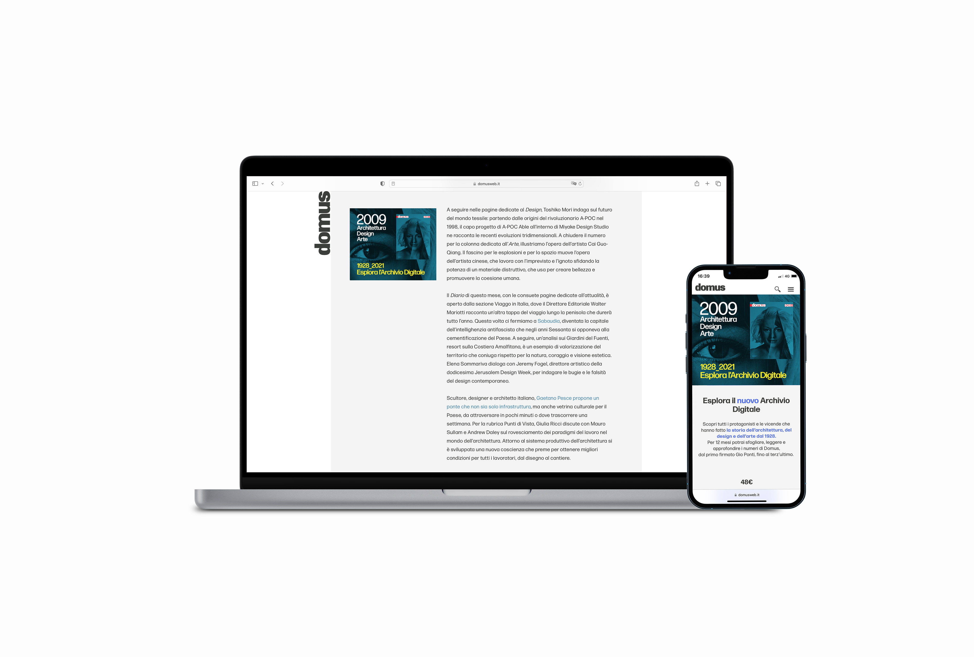
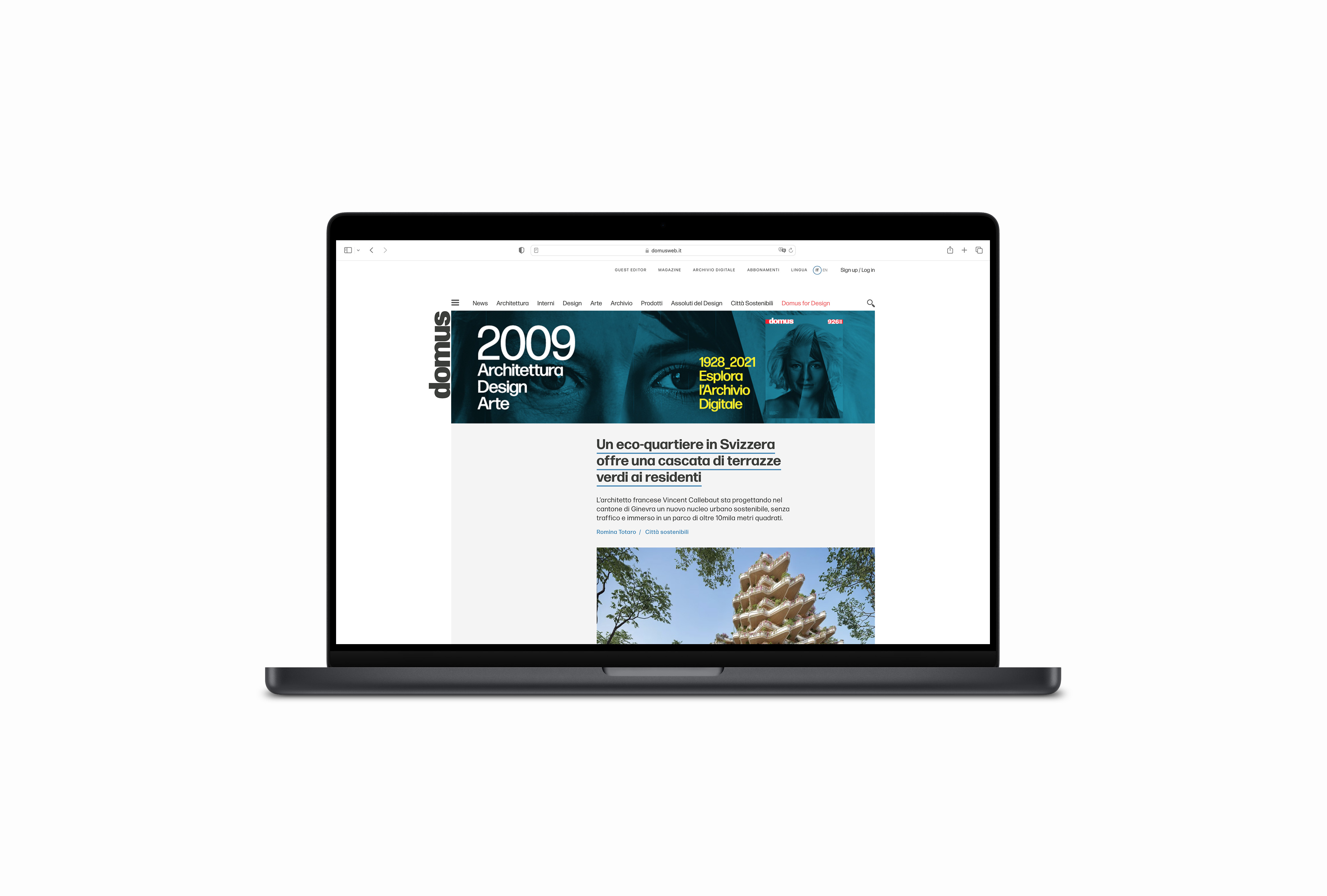
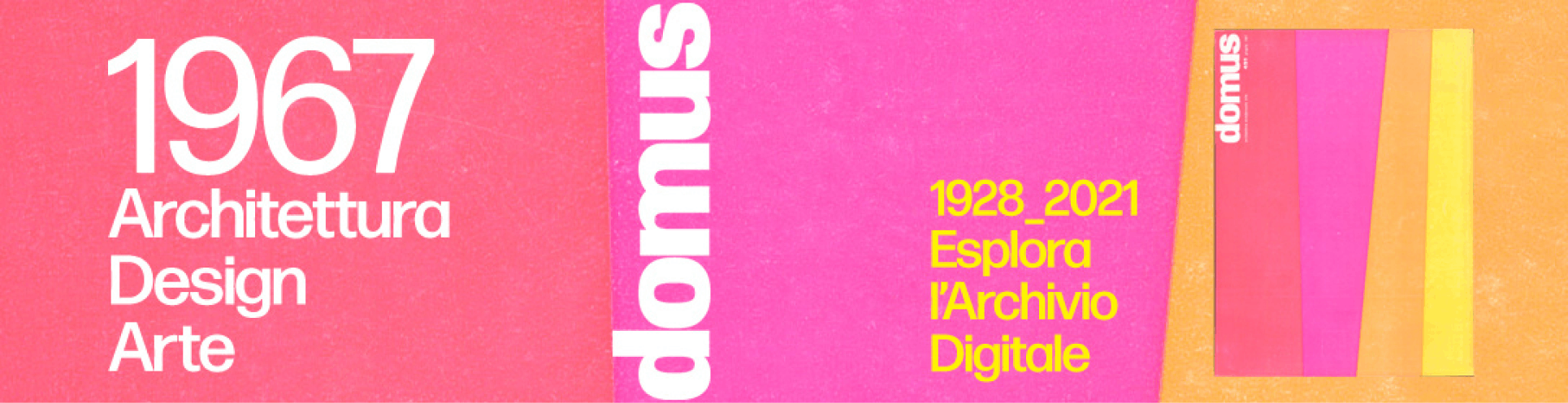
To design visual banners to promote the new Domus Archive inside the Domus webpage & digital platforms.
The Idea
The concept is Pure Geometry by terrific designer Simona Frigerio X Workroom.
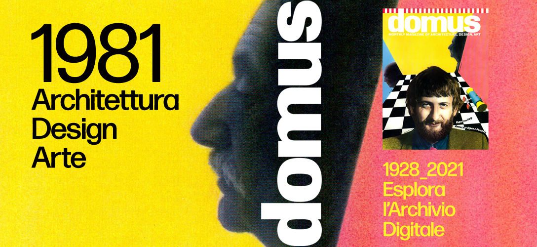
The idea focuses on Domus’ “payoff” at the center of attention in parallel with the year of magazine release.
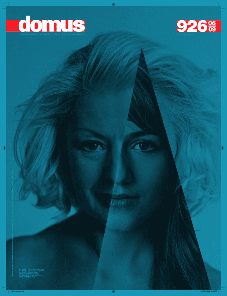
The background color of the banner is the graphic of the cover itself.
From a visual point of view, the banner takes on the background of a geometric cover, reporting its distinctive features.
The choice of the covers is more selective, because it must be geometric.
We find that the blue has a strong connotation of the photo of the face that prevails over the geometry, while the pink gives us the possibility to further develop the concept of geometry which is part of the initial concept. The final visuals result simple, structured and solid.
About Simona Frigerio
Simona Frigeriodeals with graphics and develops visual communication projects. A lover of responsible, meaningful and timeless design, she is committed to making possible things, convinced that order and design rigor are the most surprising elements of design.
Workroom is a motion design practice founded in early 2011 by Alessandro Barzaghi.
Bringing together graphic and motion design, the studio collaborates with clients from the cultural and commercial sector on a broad range of projects, including infographic animations, interactive projections, in-app animations, explainers and commercials. The studio favours a close collaboration with commissioners, from studios to direct clients; helping creating an animated project from scratch, translating informations and ideas in motion, or bringing life in existing graphics.